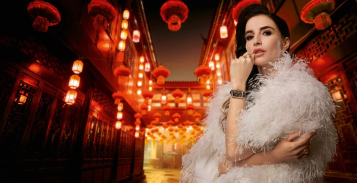
Darwish Holding is a third generation Qatari family business (previously named Bader Darwish & Partners) operating across MENA with business interests in retail, construction, investments, technology and real estate.
Our task was to coherently articulate the holding company’s diverse businesses with a new positioning, architecture, brand identity and visual design system.


Strategic
The brand strategy was centred around delivering services and products that truly benefit Qatar and its people as well as reflecting a dynamic organisation with a rich brand heritage. To achieve maximum value we developed a monolithic brand architecture for the holding company and its divisions, an approach that leverages Darwish Holding’s brand equity across its many business divisions.


Creative Solution
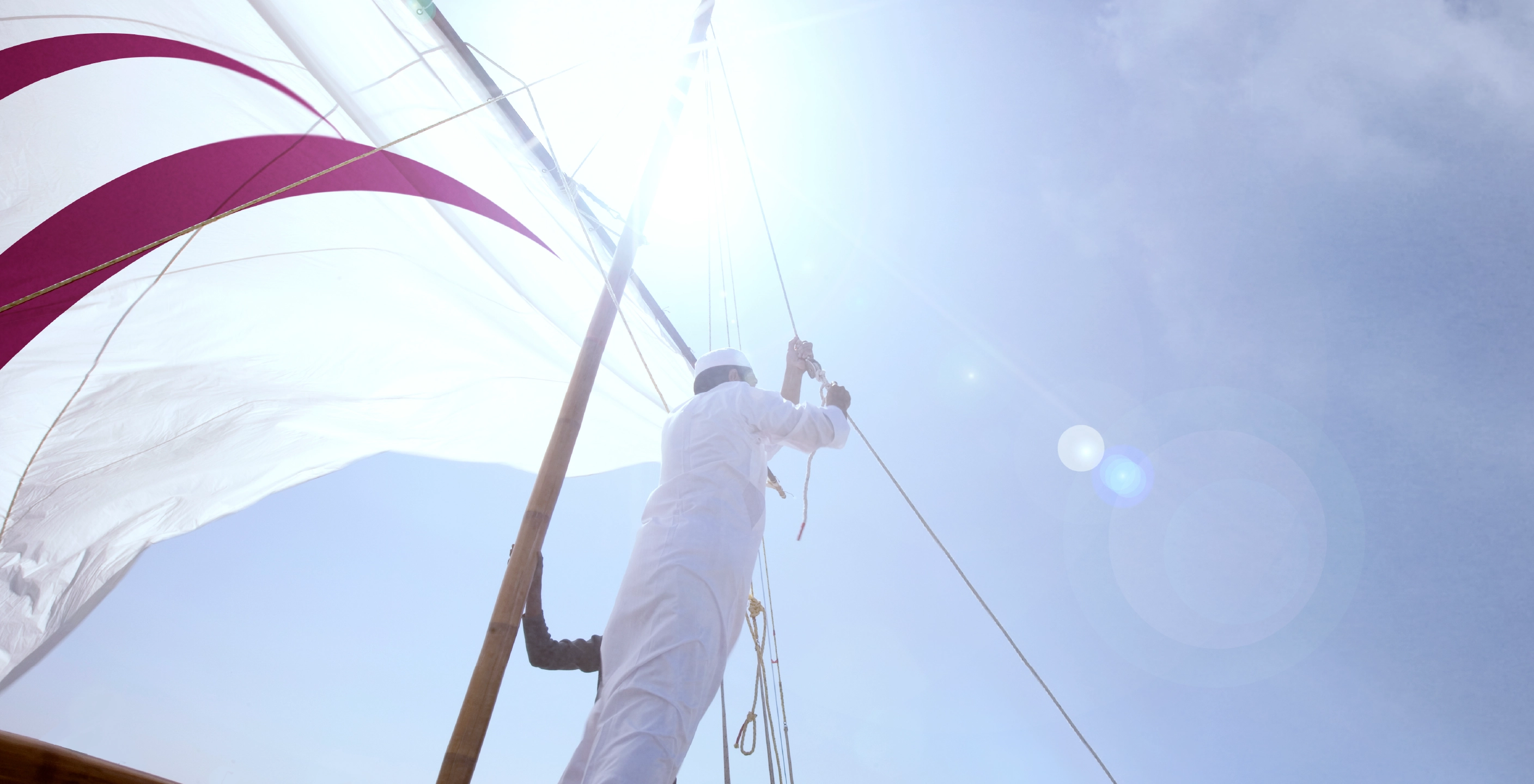
The brand identity relates to the Arabic letter ‘d’. Taking roots of the family’s pearl history, the arabesque shape pays homage to a typical Dhow boat sail. The core concept was based on the family legacy, heritage and their inspiring journey.


Reception
The simplicity of the architecture made the Darwish Holding brand more comprehensible to stakeholders and appealing to potential investors. The new positioning reinforced the presence, commitment, and value of the Qatari visionary brand. The memorable identity and visual language is timeless and has assisted Darwish Holding to carve its desirable presence and reputation in the market.
The holding company has expanded and diversified its business featuring 800 employees, represents over 100 major brands and continues to serve the people of Qatar into the future.

Project Summary
- Brand Strategy
- Brand Audit
- Brand Strategy
- Brand Positioning
Brand Expression- Brand Identity
- Visual Tone of Voice
- Brand Experience
- Brand Communications Suite
- Corporate Brochure
- Brand Management
- Brand Guidelines