


One of the most challenging tasks for designers in the Middle East is to make Arabic & Latin work together in design layouts, especially in brand marks. Many designs are simply developed to visually scream at us as we walk across a mall or drive down a street. Signposts are created just to be seen, many a times forgetting the importance of creating an aesthetically inviting melody of colour type & shape.
In the next few paragraphs we’ll show, briefly, how Arabic & English are brought together via some bad, good, and excellent examples.
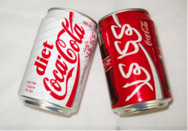
In many cases, Arabic grammar and correct letter shapes are sacrificed in the name of aesthetics.
An understanding of Arabic calligraphy & letter forms is necessary in order to create successful bilingual logo types. In the last decade, more & more bilingual logo types have been created using the Latin letter shapes. The Latino-Arab letter shapes may seem appealing at first, but if not carefully drawn may also create shapes, which are culturally insensitive.
In such cases, designers face a greater artistic challenge, which needs to keep in mind grammatical rules.
For example:
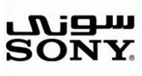
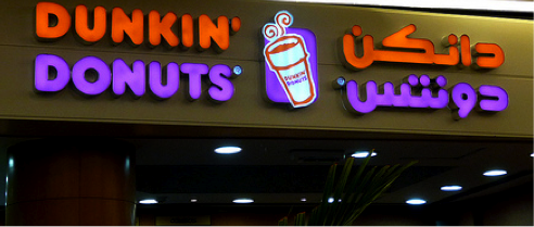
Arabic logo types sometimes have shapes added or removed in order to make them work better with the Latin equivalent where in fact they could be grammatically wrong, such as in the example of SONY. The Arabic ‘ya’ at the end has had both dots removed which makes it read ‘SONA’.
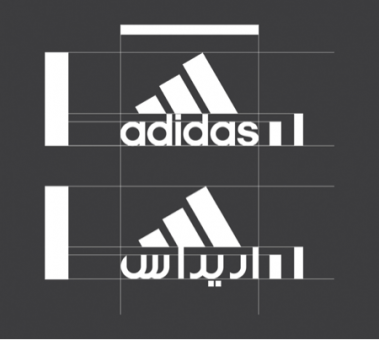
Another example, is the case of Adidas in Arabic, where the ‘d’ letter has been slightly rounded off & reads more like an ‘r’ which if not careful could be read as ‘ariras’.
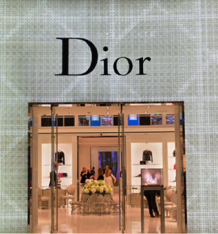
A third example is Dior. The Arabic letters in both examples are clearly taken from the Latin version and redrawn to mimic the Latin, but the outcome somewhat loses something aesthetically.
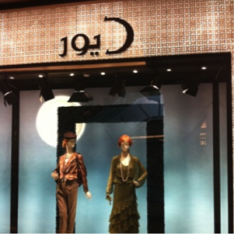
In the above examples, the Latin shapes don’t always work for the Arabic and extra attention to thicknesses, sizes, serif or non-serif details are not taken into consideration.
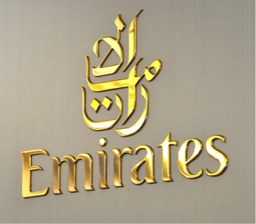
However, there are cases, where an Arabic calligraphy form or typeface is chosen to complement the Latin and yet manage to work in beautiful harmony.
As in examples below –


The last set of designs shows another level of successful merge of Arabic & English where none are made to copy or mirror the other.
Examples below show bilingual logotypes, which were not meant for the Arabic & English to be exact copies & yet work beautifully well together. They show the elegance of both scripts individually, merging together in one unified shape.
Evidently, some bilingual logo types work better than others. Perhaps few may argue that designers today have an invisible unmentioned authority to bend the rules of grammar & shape a little to suit the thriving & ever competitive branding market – but how much is too much?
As the famous typographer once said:
“Typography is two-dimensional architecture, based on experience and imagination, and guided by rules and readability. And this is the purpose of typography: The arrangement of design elements within a given structure should allow the reader to easily focus on the message, without slowing down the speed of his reading.” Hermann Zapf