


 How much does the right brandmark do for you? A lot, we’d say.
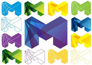
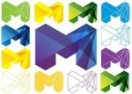
Surrounded by hundreds of “designs” nowadays, there are only a few that manage to leave an impression – one, in recent times, being the logo of the city of Melbourne.
What may seem as a simple “M” at first sight soon unveils a plethora of design ingenuity. Fresh, vibrant, celebratory and enigmatic are just some of the words that pop into one’s mind when seeing this colorful ‘M’. One of the greatest cities in the world, Melbourne’s “M” does an excellent job representing the city’s sporting, culture, music and business and in positioning it as fun, modern and forward-looking.
Not afraid to experiment with changing colors, the “M” is also an example of a “living brand” that adapts beyond the conventional, static logo, taking branding and design to a new level.
So…get inspired, and dare to be different!