Creative Solution
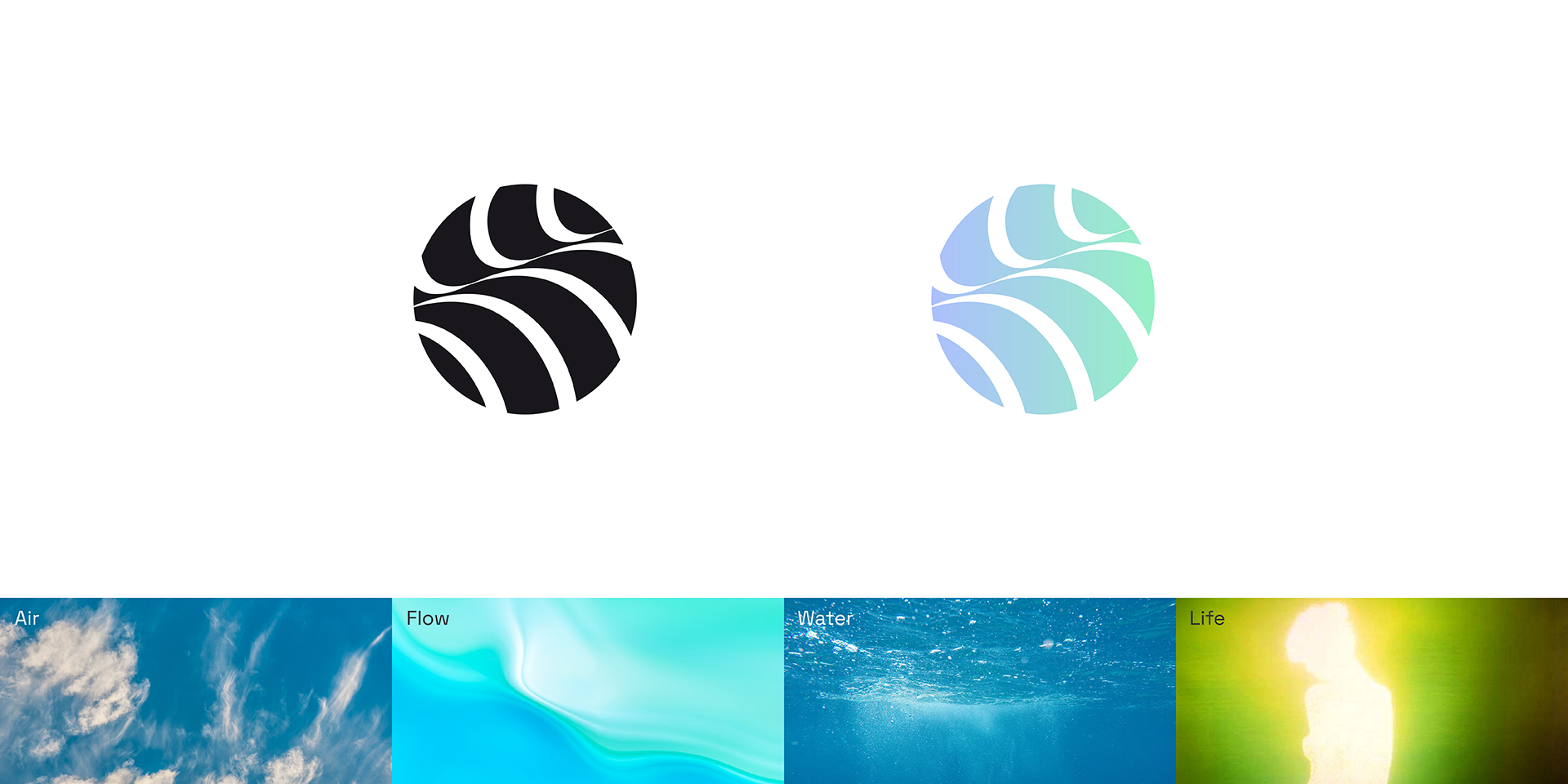
For Nia’s new visual identity, we wanted to create a logotype that symbolises Life; particularly, symbolises air and water as in addition to these two elements being vital to life, they also poetically give a nod to Nia’s foundational product line of HVAC.
Resultantly Nia’s logotype illustrates life, flow, and vitality. Put simply, it conveys Nia’s promise of a fulfilling, enriched and comfortable living that’s made possible with its exceptional products. Made up of a crafted roundel brandmark and a unique wordmark, Nia’s logotype reinforces the brand’s commitment to the HVAC, living and well-being space.
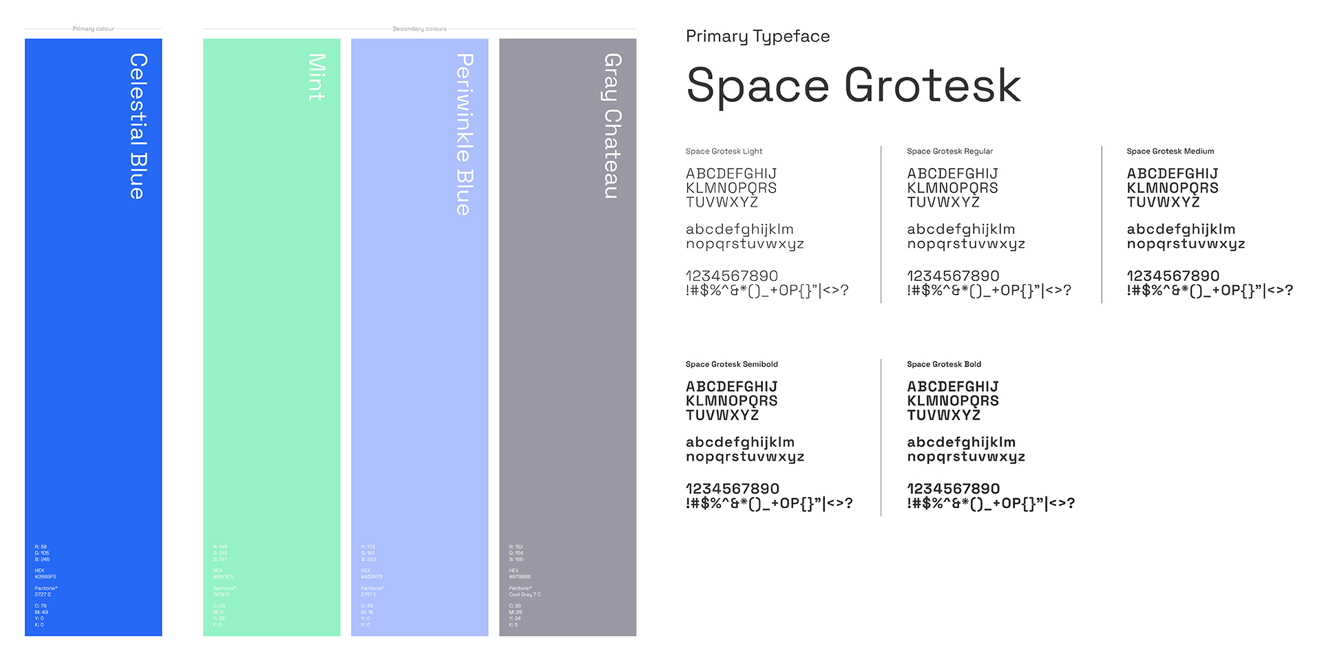
Supporting the logotype are upbeat yet tranquil brand colours that reiterate a feeling of life, living, well-being and comfort, whilst also conveying trust and dependability in Nia.
With its modern, human, and simple approach Nia’s logotype reassures in a firm yet friendly way. It is strong, empowering, and legible and in time will act as a mnemonic devise that signifies Nia’s spirit and energy.
Reception
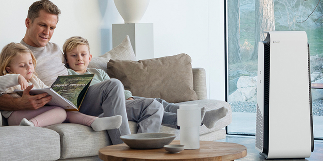
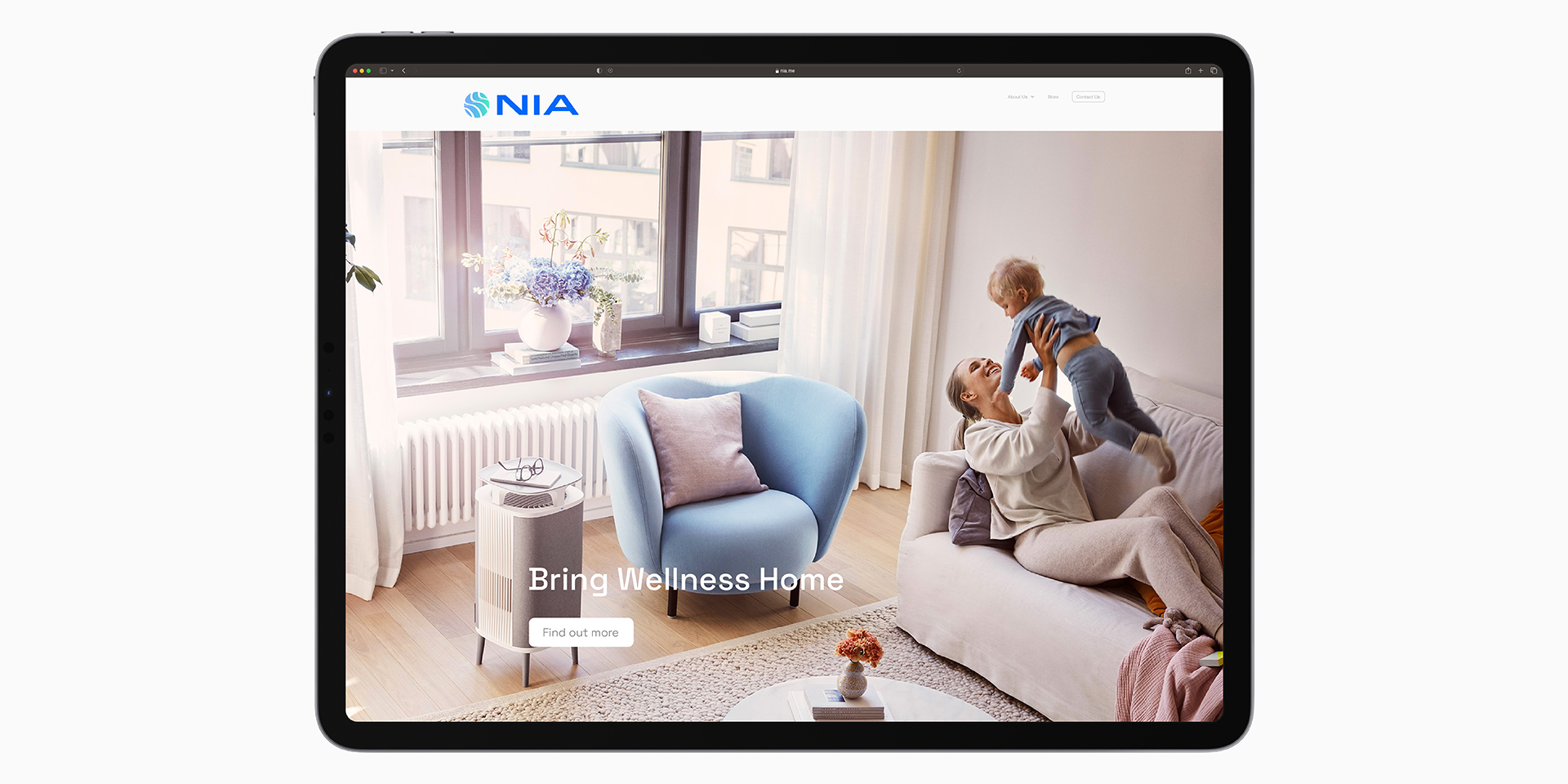
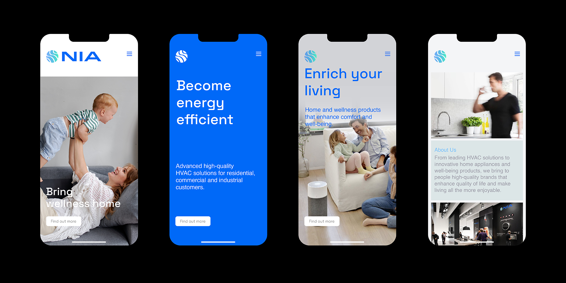
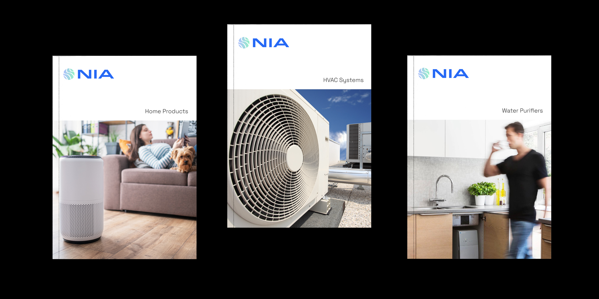
Nia’s rebrand repositioned the organisation from a HVAC-focussed distribution house to a home-grown brand that has deep foundation, strong ethics, and a wide portfolio – and whose relentless ambition is to do good every day.