Mubadala Aerospace’s revised strategic focus brought together its businesses Sanad Aero, a leading aviation leasing entity, and TS&S Aerospace, an aircraft engine MRO service provider, to create Sanad, an Integrated Service Provider.
The brief was to develop a new brand that carried decades-old legacy but also represented a new organisation, which is ambitious, future-focussed and the first of its kind in the region.

Strategic
As we began the brand audit – stakeholder workshops and interviews, industry,
customer and competitor research – one thing became evident: ‘support’ was at the
heart of everything the two organisations did. Rightfully so, ‘support’ was the key
sentiment we relayed into the new brand’s positioning, a recommendation that had
unanimous stakeholder buy-in at the very first presentation.
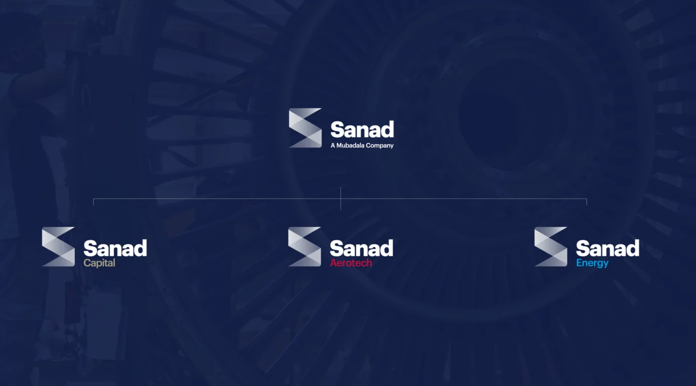
Leveraging brand equity from Sanad Aero, while formulating a name that directly conveyed the new brand’s positioning, we named the new organisation ‘Sanad’: the Arabic word for support. A monolithic brand architecture system guides sub-brand naming and management: Sanad Aero is now Sanad Capital and TS&S Aerospace is now Sanad Aerotech.
Sanad’s strategic platform builds on the human, progressive, collaborative and future-facing aspects of the organisation. “Support where it really matters” as the brand essence guides everything Sanad does, from embracing innovation to investing in key capabilities, all of which enable customer growth and excellence. From brand values to tone of voice, = Sanad’s brand strategy is geared towards its vision of “becoming a champion of the Advanced Industries sector”.

Creative Solution
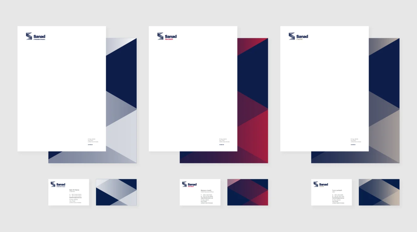
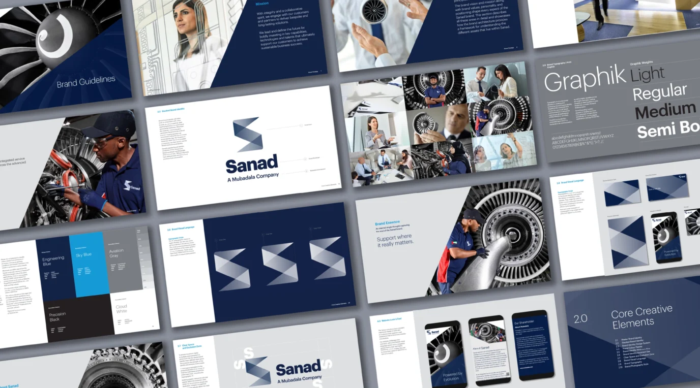
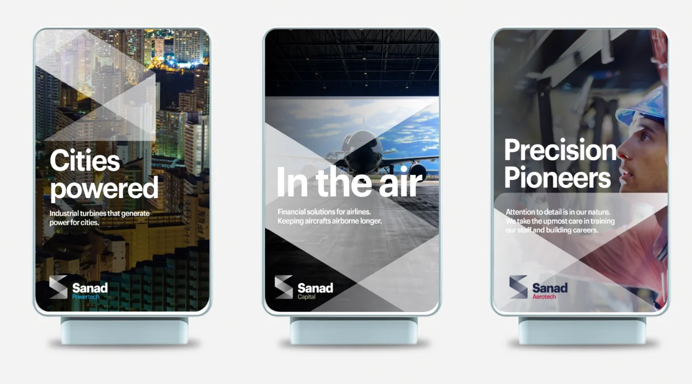
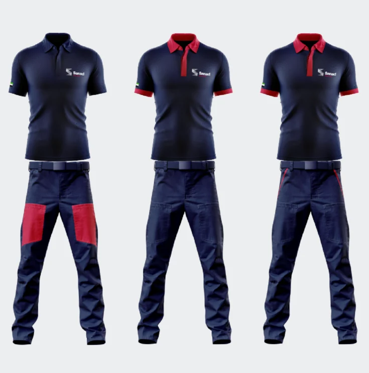
A visual representation of expertise and excellence, Sanad’s brand identity features a sharp and structured ’S’ and a crafted word mark. Establishing the hierarchy between parent and sub-brand is an intelligent design system where while sub-brand icons and wordmarks are in primary blue, to distinguish them from one another their names are in a colour that is a visual expression of their offering.
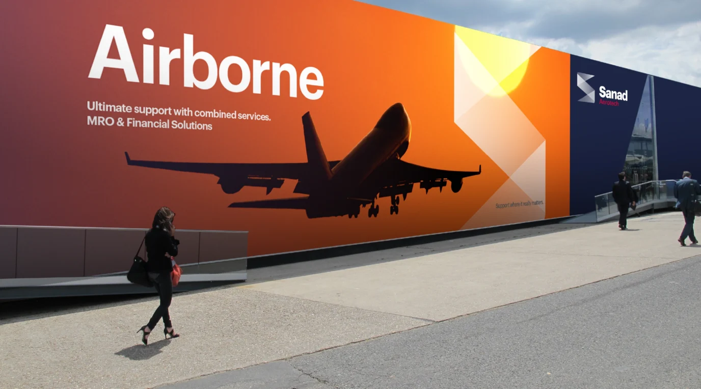
Key to Sanad’s brand identity system is its graphic language that is derived from the ‘S’ icon. Serving as a hero element, the super graphic serves as a link to the brand identity across the brand communication suite.
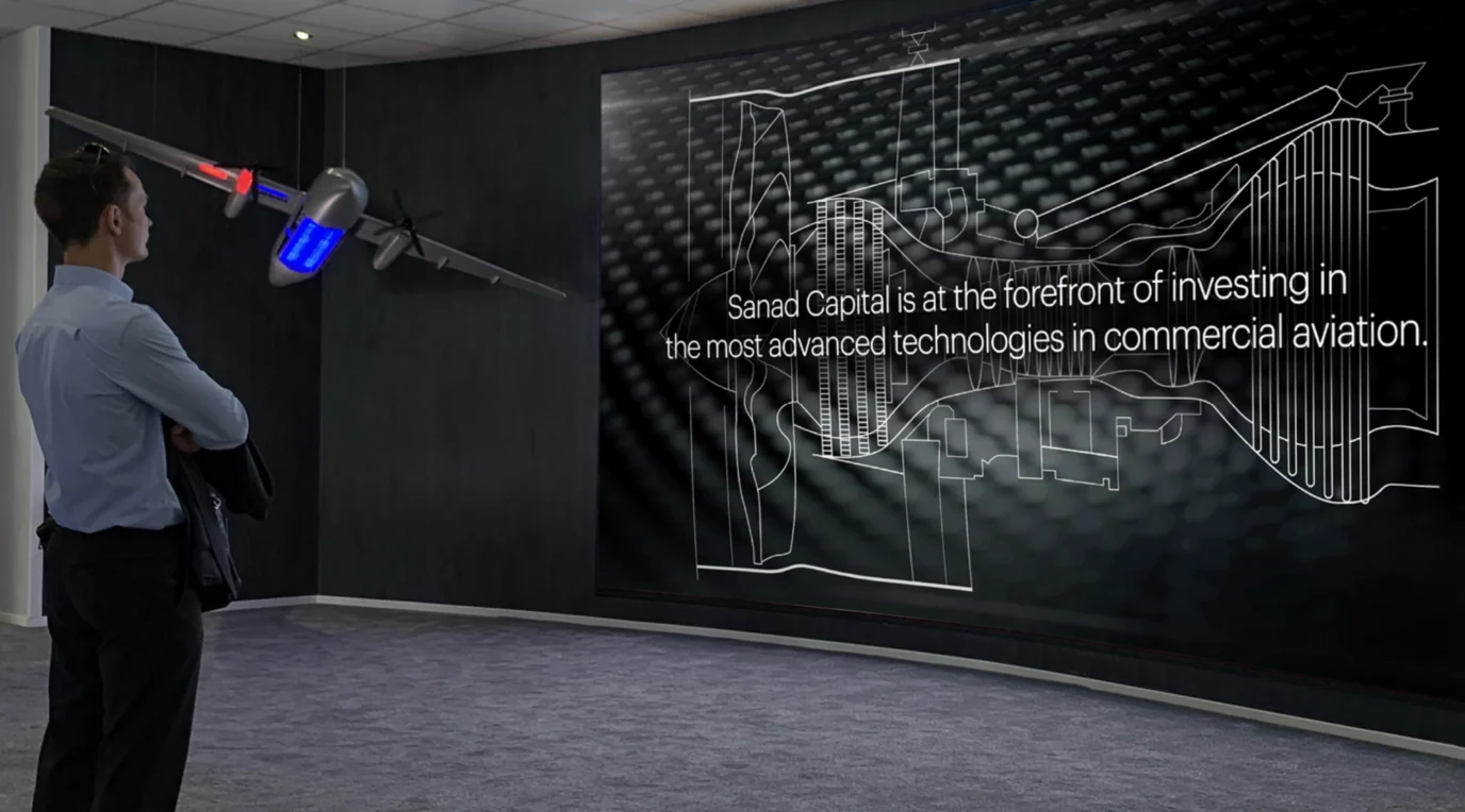
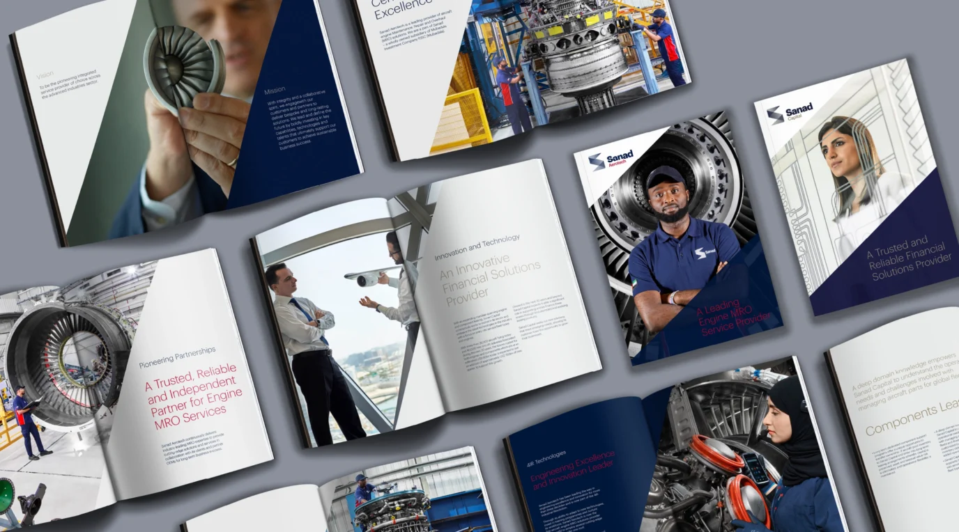
To capture the world of Sanad we conducted a 3-day photo shoot and 2-day video shoot, which resulted in engaging image and video library. To convey the brand digitally we also built the corporate website undertaking copywriting, design and development. For Sanad’s launch at the Dubai Airshow we created an interactive interface and series of video that showcased Sanad’s role in the world of aviation.









Project Summary
- Brand Strategy
- Brand Workshops
- Brand Positioning
- Brand Strategy
- Brand Naming
- Brand Architecture
- Brand Expression
- Brand Identity
- Copywriting
- Visual Tone of Voice
- Brand Photoshoot & Image Library
- Brand Experience
- Brand Communications Design
- Print Applications Design
- Website Design & Development
- Corporate Videos
- Brand Animations
- Brand Management
- Brand Guidelines
- Brand Launch


