
The US government’s wider overhaul of Federal Agency graphics saw the replacement of NASA’s meatball logo, one of the world’s most powerful symbolic logos, with the iconic NASA wordmark logo — a wordmark that originated over 45 years ago. A brave decision by NASA driven by the vision to change the brand’s positioning from being just a space exploration organisation to being a broader problem-solving organisation that brings tangible deliverables to the economy: “NASA can stand for anything” was the driving thought behind this decision.
The NASA wordmark was designed by Richard Danne and Bruce Blackburn in 1974. It had no spacecraft, moon, stars or stripes. Just a logotype with modern style of lettering that worked alongside Helvetica type, in a single colour, Pantone 179, which over time has come to be known as the NASA red. The duo presented only one design concept, which they brought to life across various touchpoints ranging from B2B materials to space shuttles. The nickname the N-A-S-A ‘Worm’ logotype was born and an icon was created.
Unfortunately history was not very kind to the ‘Worm’ logotype. 17 years after its launch, NASA had a change in management and a new administrator, Daniel Goldin. Following a chain of disastrous events such as the Challenger accident and some failed launches, in 1992, Goldin decided to reinstate the meatball design (launched in 1959) as he felt this was the identity that would boost the workforce morale.
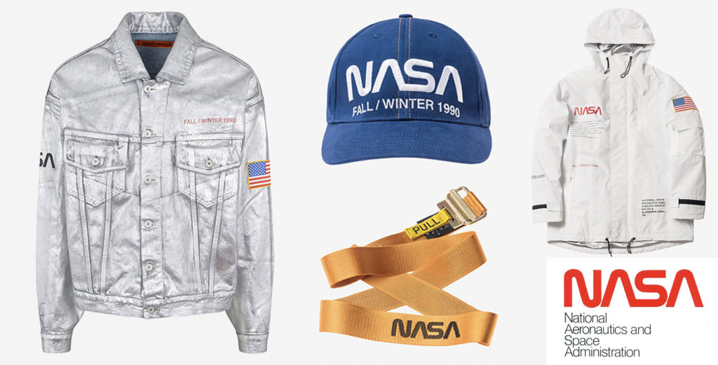
However, a memorable design like the N-A-S-A ‘Worm’ logotype is not easy to let go. A cult visual of the seventies and eighties, people worldwide had great nostalgia for the wordmark. With its broad appeal, fashion brands embraced it for many years. Recently pop singer Ariana Grande embraced the logotype as her muse. In line with its public mission of using its name style, the N-A-S-A ‘Worm’ logotype is one of the few symbols where owners do not charge any licensing fee. Companies only require written permission to use the logotype.
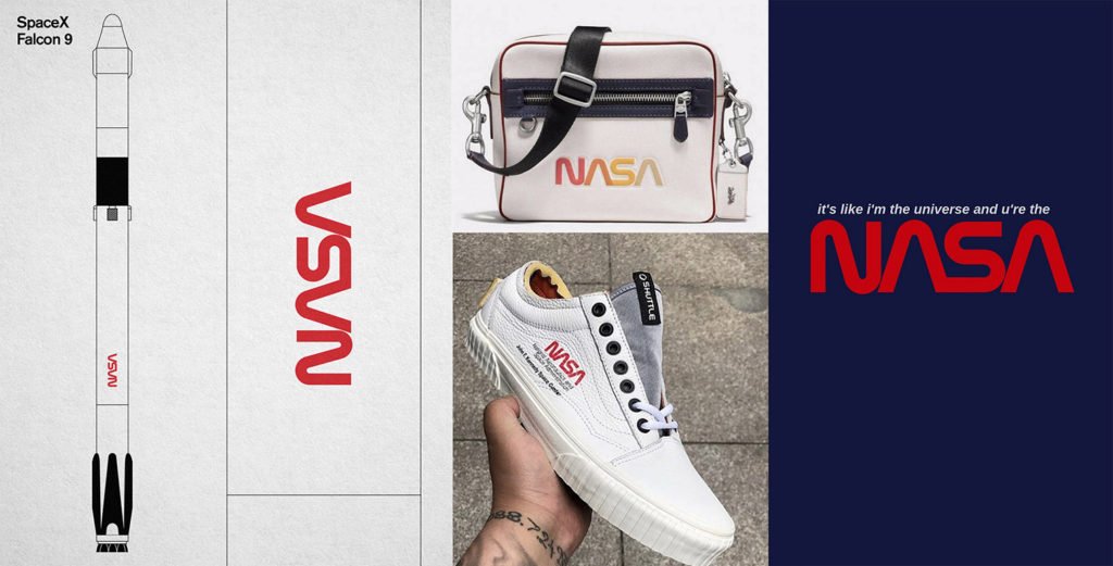
It was ultimately Elon Musk’s SpaceX’s Falcon 9, the rocket that will ferry astronauts to the International Space Station, that heralded the return of the iconic logo. SpaceX commemorated the beloved NASA icon to its rightful status of ‘pioneering adventure’ by stenciling it onto the side of the Falcon 9 and stitching it onto astronauts’ clothing.
![]()
![]()
The return of the NASA Worm logotype proves that it’s not about creating a new logo for every brand initiative. At James we are thrilled to see the iconic wordmark return to its ongoing role in the Aerotech and Space brand universe.