


Innovation and dedication, progress and passion: The World Expo stands for the pinnacle of human advancements. Every five years for six months at a time the world turns its attention to the globe’s largest meeting place — bringing together the 170 member countries, their pavilions and ideas into one location.
The first world exposition took place in London as early as 1851 with another 32 to follow over the next 16 decades. From those early days, the expos have developed from showcasing industrial progress and national prestige to finding innovative solutions to global challenges, such as in the case of Expo Shanghai 2010’s urbanism and Milan 2015’s nutrition.
The honour of hosting the next World Expo in 2020 was won by Dubai back in 2013. United Arab Emirates’ biggest city is well under way in preparing for the millions of attendees expected to visit the prestigious event. The theme for Expo 2020 is ‘Connecting Minds, Creating The Future’ which encapsulates the fostering of creativity, innovation and global collaboration.
2020 also symbolizes the first time a World Expo is held in the Middle East, and where better to host it than in Dubai. A symbol of creativity, innovation and global collaboration in its own right, Dubai would not have been the vibrant city we all know today without just that.
As a homage to the World Expo’s creativity we have gathered an overview of the exhibition’s brand identity evolution from the mid 19th century until today. It’s interesting to see how the designs have been influenced by the time and place in which they were created. It took almost 90 years from the first Expo to New York’s 1939 before they realised the importance of using a logo to promote the event, until then the norm had been elaborate poster designs.

Other fast Expo logo facts:
– The theme for the 1967 Montreal Expo was ‘Man and His World’ — portrayed through the artist Julien Hébert’s identity design. The core element of the identity is an ancient symbol of man, which was then linked into pairs to represent friendship. The circular duplication arrangement represent friendships around the world.
– The 2010 Shanghai Expo logo is inspired by the Chinese character for ‘world’ [世”], designed to resemble friendship where three people are holding hands.
– The theme for the 2015 Milan edition of Expo was ‘Feeding the Planet, Energy for Life,’ which encompassed technology, innovation, culture, traditions and creativity, emphasizing how all of that can relate to food and diet. The brand identity was chosen following a design competition that saw numerous students from different creative disciplines take part. The winning entry symbolised how something in combination can create something more, as in the different layers that make up the logo or how a few simple food ingredients can make a vast amount of different dishes.
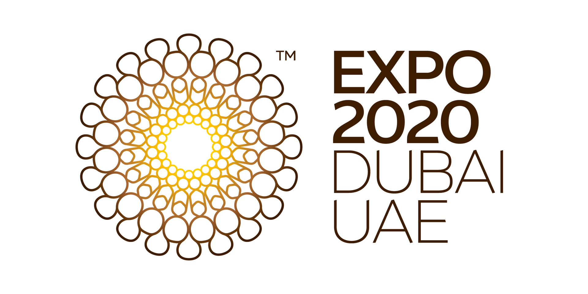
– The Dubai Expo logo is inspired by a gold ring that was found in the UAE desert at a 4000 year old archeological site, emphasizing the ancient history of the area.