
Branding any company is a huge challenge, but rebranding one of the world’s biggest companies is a project that many a design agency would love to take on. However, with massive projects comes massive risk, and at times, even the best of brand strategists get it wrong.
Rebranding is a tricky business for any organization, but in many cases, change is inevitable if brands want to grow. Before undergoing any rebranding exercise, companies should consider customer loyalty, affinity to the existing brand, emotional attachment, brand awareness, as well as the clarity of design, content, name, and messaging of any new brand they implement. Do customers like the current brand? The colors? The name? Is the current logo identifiable? Do people know the brand on sight even if it is “ugly”? How would any changes, however small or insignificant, impact sales and customer perception?
Imagine how you would feel if you popped in to buy a can of coke and found the classic white logo and red packaging replaced by blue and green and some unrecognizable graphic.
Exactly.
We take a look here at some of the biggest rebranding fails, many from companies we love and support, and most of whom have reverted back to the original brand after huge backlash and public protest to changes. The point: a brand is more than just a name or a picture on a logo—brands build relationships, drive business, and foster growth…when done correctly and not tampered with to confuse, aggravate, and alienate customers.
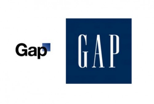
Classic Gap To Confused Gap:
Gap decides to try and make their classic identity a bit more modern, but instead creates a logo that looks like “a child’s clipart design” and is forced to change back almost immediately amid customer outrage and negative publicity.
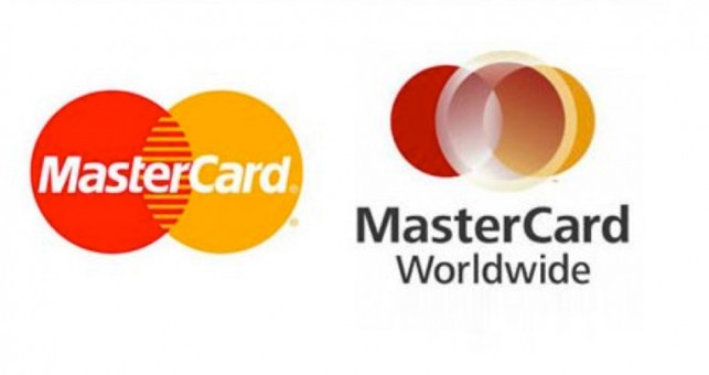
MasterCard Not Really Mastering The New Logo:
With a logo that is universally recognized (and plastered across businesses and points of sale everywhere on Earth) Mastercard felt that it should change its logo to look more exciting and contemporary, but instead puts out something that has been deemed “ugly, boring, pointless, and ridiculously designed”. Needless to say, MasterCard quickly scrapped the new logo and decided “old is gold”.
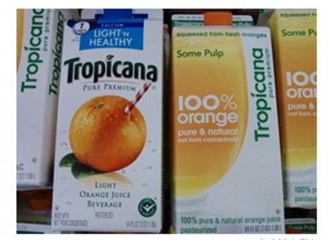
Tropicana Serves Fresh Juice in Stale Packaging:
Customers want their wholesome, fresh-squeezed, family-friendly orange juice in the packaging they know and trust—not some abstract, neo-modern carton that neither children nor their parents recognize as the brand they depend on.
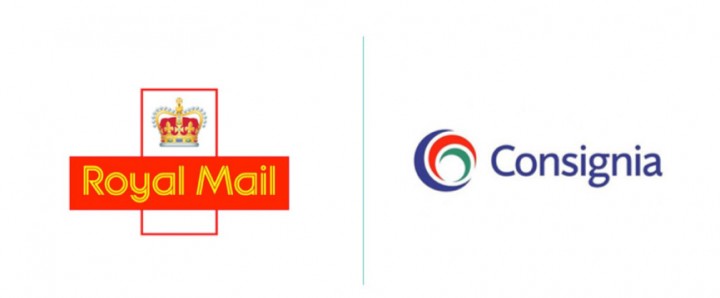
Royal Mail Makes Royal Rebranding Mess:
For reasons unknown, the UK’s largest mail carrier decided one day to not only change the identity of the company, but also the name, the logo, the colors, and basically the entire personality of the brand. The carrier moved away from their classic, recognizable, distinct identity with a descriptive name and an emblem that fosters trust and respect, to a new identity completely disjointed from the original, with a new name (that nobody can pronounce) and a new brandmark (that nobody can identify). It took a year (and the wastage of £1.5 million to launch Consignia), but eventually the company threw in the towel and decided to return to their original identity (but not before doling out another £1 million to go back).
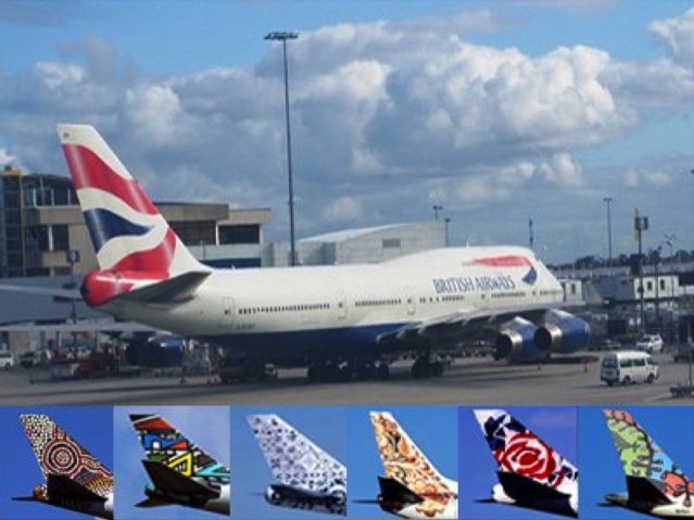
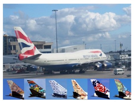
British Airways Decides It Likes Being British After All:
After a brief adventure into what can only be deemed as the airline’s Blue Period, British Airways realized that its ploy to paint the tails of it’s aircrafts with different pieces of art and design, actually served no purpose at all except to cause confusion amongst passengers and customers about which plane they were flying on. They brought back the Union Jack and returned to their British identity, so that the customers would come back as well.
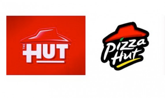
Pizza Hut’s Half-Baked New Brand:
Who doesn’t love a good pizza? Especially from one of the world’s most famous and favorite ovens? A brand famous for its delicious offerings, reasonable prices, and speedy home delivery, Pizza Hut does NOT deliver with the new identity, which not only looks different, but eliminates the word “pizza” from the brandmark altogether. The Hut? It most certainly does not catch on—and instead of feeling cool and hip, ends up sounding (and looking) rather…bland.